My Role
Lead Instructional Designer & Developer (end-to-end)
Owned learning strategy, scenario design, interaction patterns, microcopy, visual consistency, and the Storyline build—plus pilot facilitation and revision planning.
A scenario-based learning module that helps people pause, verify, and communicate responsibly when using AI at work.
Tip: Cards expand on click (or hover on desktop). Click images to zoom.
This project focuses on a single challenge: helping people use AI with judgment and accountability. The snapshot below summarizes my role, the learning format, the toolset, and how I defined success.
Lead Instructional Designer & Developer (end-to-end)
Owned learning strategy, scenario design, interaction patterns, microcopy, visual consistency, and the Storyline build—plus pilot facilitation and revision planning.
Multi-Scene Storyline 360 scenario module
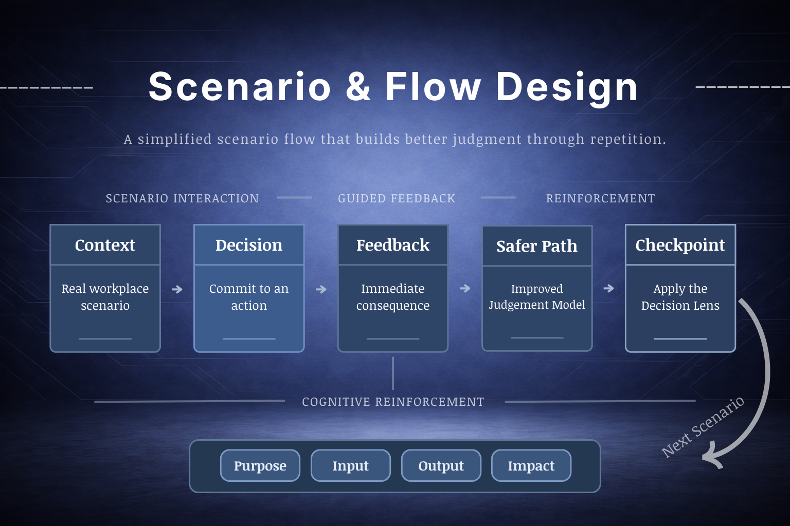
Convergent flow with targeted feedback—so learners explore consequences without getting lost in branching complexity.
Articulate Storyline 360 • Canva • ChatGPT
Storyline for interaction and logic, Canva for visual/asset design (backgrounds and UI elements), and ChatGPT to speed up early storyboards and copy drafts while keeping final content human-reviewed.
Clarity over cleverness
Learners should quickly understand what’s being asked, why a choice is safer or riskier, and what to do next—without feeling “tricked” or graded.
The goal isn’t to teach a list of rules. It’s to build a repeatable habit people can use under time pressure: evaluate → verify → proceed.
In many workplaces, “use AI” becomes the default. But people aren’t always given a shared standard for what’s safe, what needs review, and what should never be pasted into a tool.
The risk isn’t only confidentiality—it’s also unreviewed inputs, over-confident outputs, and unclear accountability.
Scenario-first practice that builds decision judgment without “gotcha” scoring.
Learners choose an action, see consequences, then get a safer alternative that models the better move (including when to verify and how to communicate uncertainty).
I kept the experience intentionally calm and consistent so learners focus on thinking—not figuring out the interface.
I ran a small, cross-functional pilot to validate clarity, flow, and decision framing before portfolio release.
I approached this like a real deliverable: define the decision problem, prototype quickly, test for clarity, refine interaction rules, and ship a polished release.
What I did: turned real workplace “decision moments” into a teachable, repeatable flow.
Why it mattered: reduced ambiguity—learners understood what the scenario was asking and why it mattered.
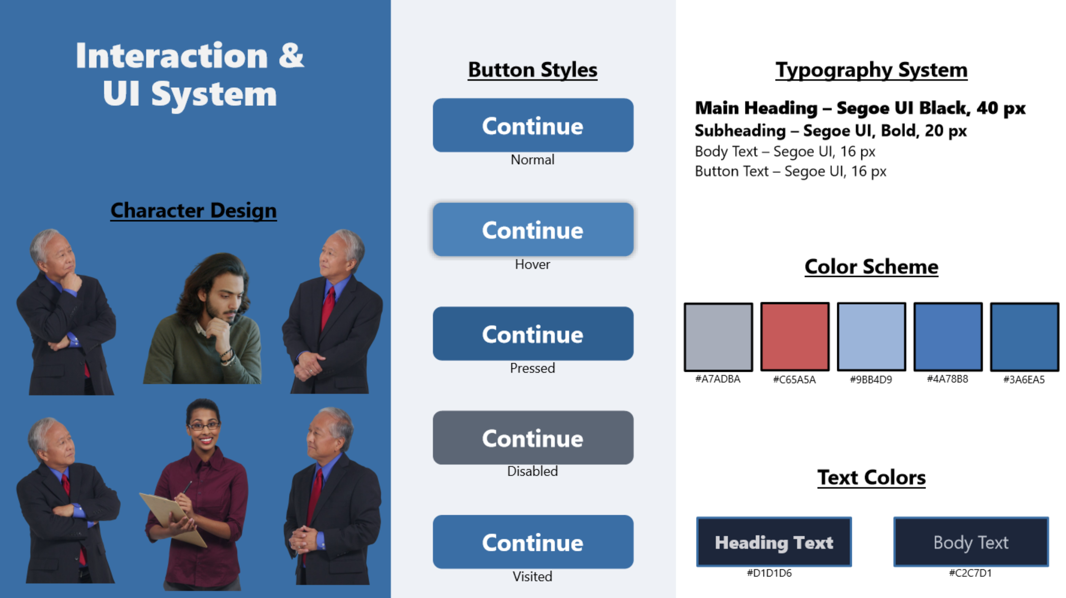
What I did: built consistent patterns (states, prompts, feedback layers, navigation cues).
Why it mattered: less friction. Testers spent time thinking about decisions—not hunting for the next click.
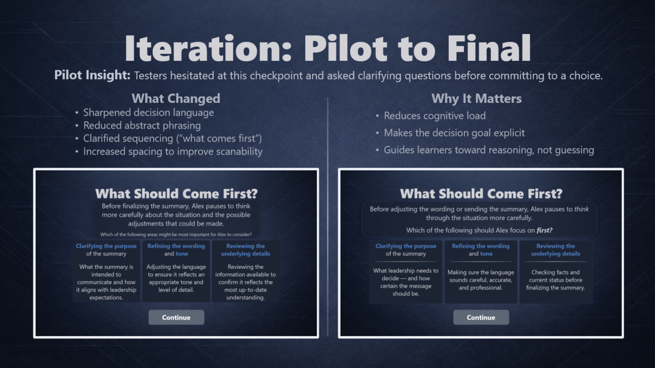
What I did: gathered tester feedback, grouped issues, prioritized fixes, and retested.
Why it mattered: improved clarity and confidence without turning the experience into a compliance lecture.
This module was piloted with cross-functional peers prior to release to validate clarity, interaction flow, and adoption of the Decision Lens. Below: a compact, evidence-forward view of what the pilot revealed and the targeted fixes that followed.
Representative tester notes:
“It took me a second to understand what each prompt/choice was asking.”
“Some examples felt high-level — not sure what the right answer hinged on.”
“Text felt squished into the boxes, and a Continue state didn’t always highlight.”
These short quotes represent recurring patterns across pilot passes: clarity gaps, inconsistent terminology, visual density, and minor interaction friction.
These interaction examples demonstrate how the scenario architecture translates into practice — guiding learners from decision to feedback to structured reinforcement.
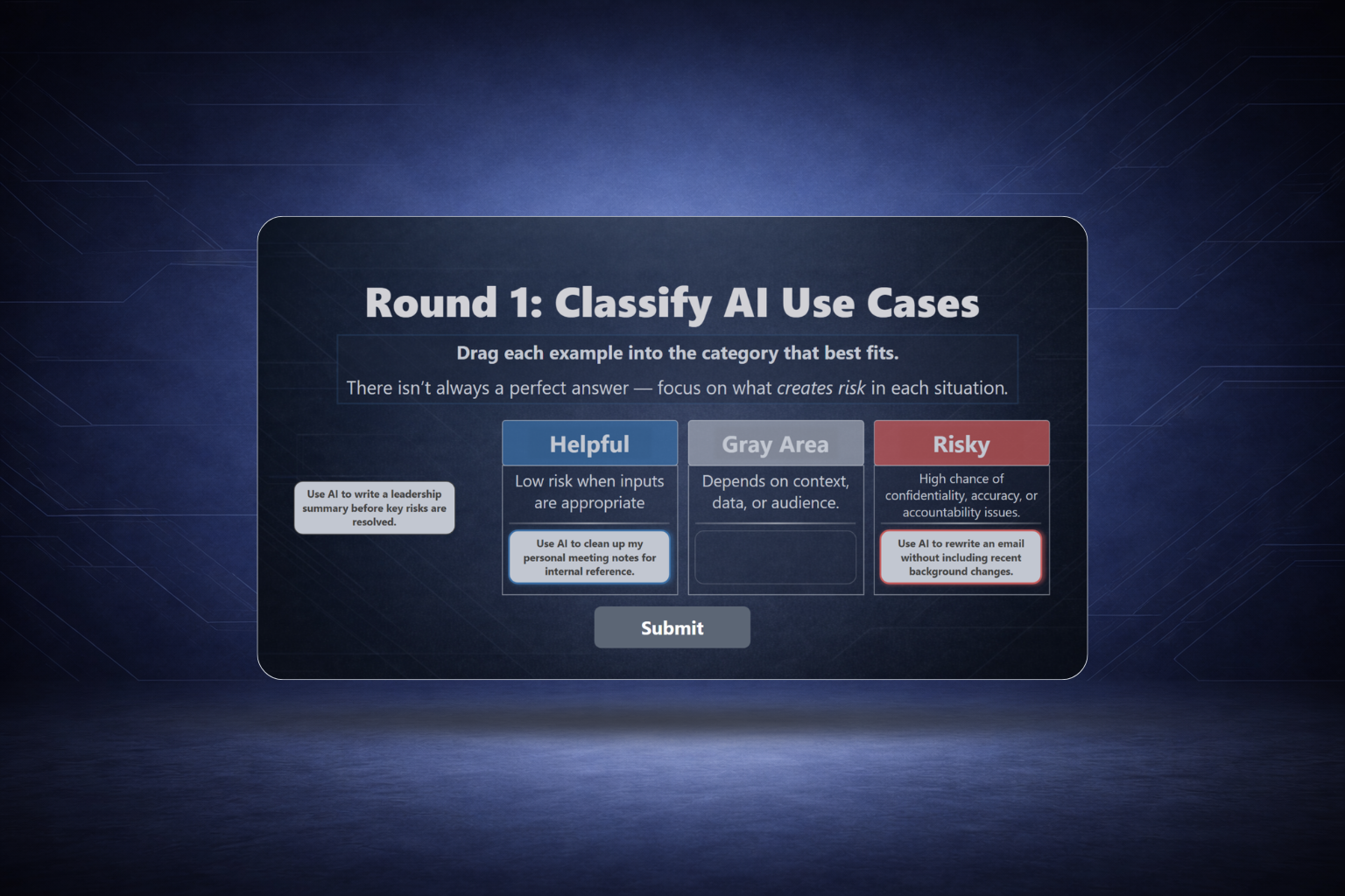
Learners sort realistic prompts into Helpful, Risky, or Gray Area—then receive feedback that explains the tradeoffs in plain language.
A choose-your-action moment where learners commit, see consequences, then review a safer alternative that models better judgment and verification.
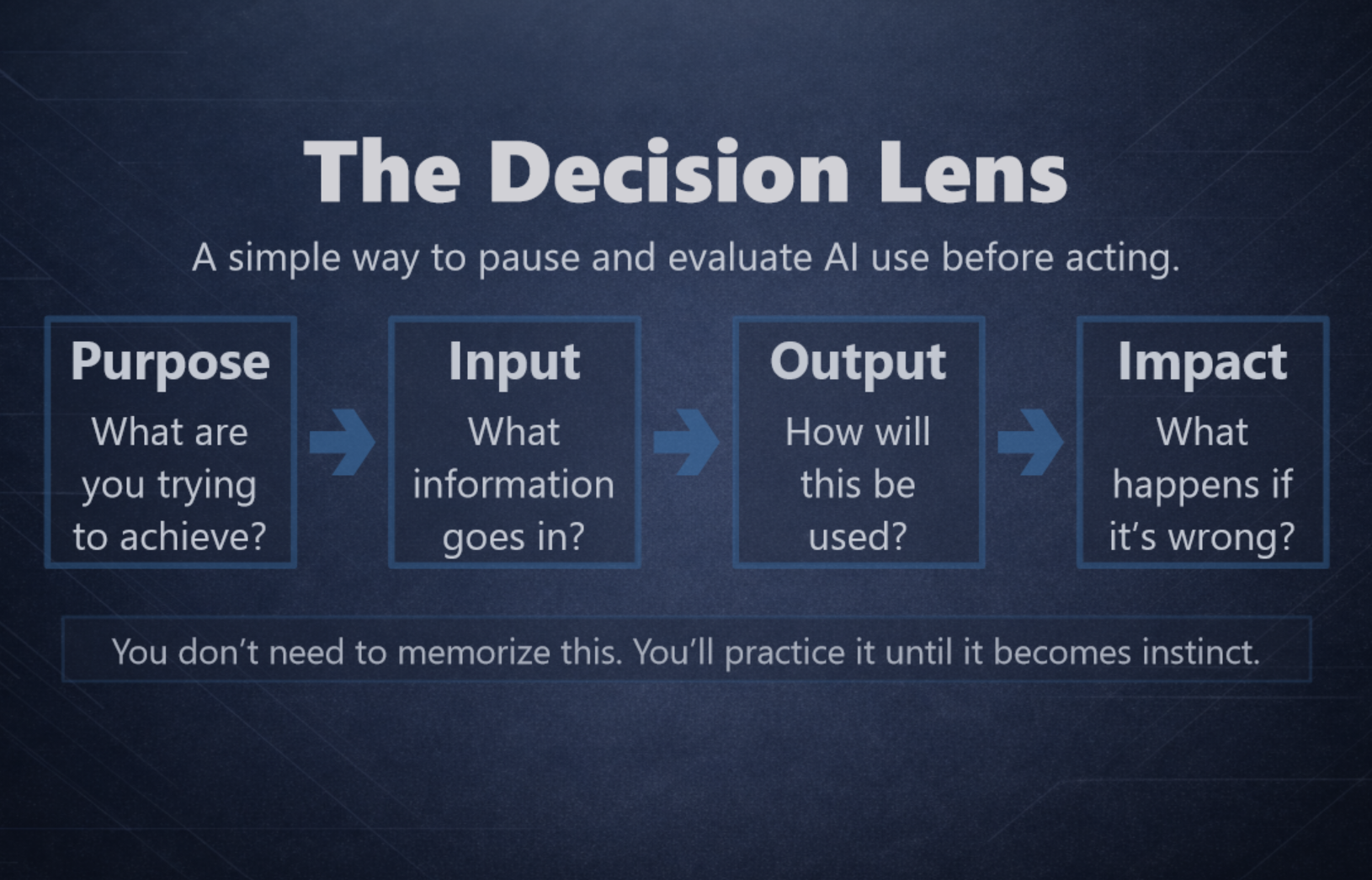
A consistent decision lens—Purpose → Input → Output → Impact—used across scenarios so learners build a habit, not just knowledge.
Want to see the full experience? Use View Live Experience at the top of this page.
